


 EN
EN
 PL
PL
 DE
DE
 FR
FR


Trend: The Art of Contrast
26.08.2024|
Vivid colours are intense and bold. They are typically used to add energy and dynamism
How to use contrasting colors in the interior?
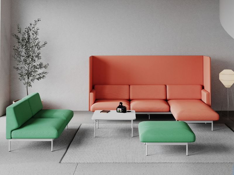
Choosing vibrant, energetic colors such as deep green, mustard yellow, or classic blue is a great method to break the monotony of monochromatic arrangements.Practical and economical solutions include colourful accessories that enable easy changes in decor as needed. These could be colorful curtains, cushions, vases, or posters. A bolder approach could involve painting one wall in a vibrant color, using striking upholstery colours, or opting for furniture fronts in contrasting colours. Regardless of the choice, it is crucial to match the colours with the existing interior palette to achieve coherence and harmony throughout the space.
at the picture: Fora
Use the colour wheel to guide your colour selection.
Complementary colours: They are opposite each other on the colour wheel. Combining these colours creates a striking contrast, imparting a dynamic character to the interior. Such contrast is ideal for creative spaces like art studios, as well as areas designated for relaxation and entertainment. Contrasting colours: These colours involve pairing colours that, while not directly opposite on the color wheel, still create a distinct contrast without achieving the extreme effect of complementary colours. An example could be combining blue with red using more subdued shades of both colours. Contrasting colours are excellent for emphasising specific elements within the interior.
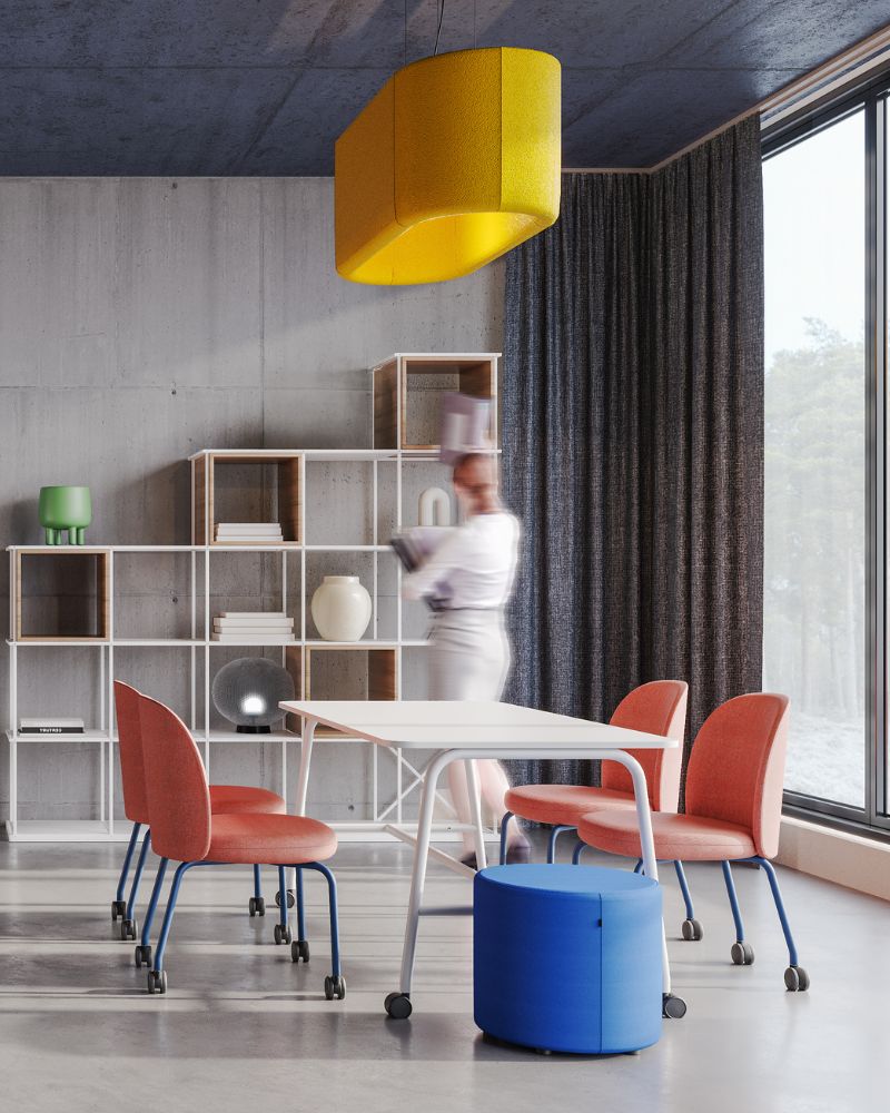
at the picture: Flos, Saar, Point In interior design, vibrant colours can serve as focal points, drawing attention and imparting character to a room. They can be used to highlight certain features or create balance between different areas of the space. However, it is important to use these colours judiciously and in a balanced manner to avoid an overwhelming effect. Contrasting colour combinations allow the creation of diverse styles and expression of emotions. Their appropriate application can significantly impact |